These website homepage ideas will help optimize one of the most visited pages on your site—the homepage.
Get it right, and your visitors will feel welcomed and eager to engage. But, on the other hand, if you miss the mark, you may as well be writing Lorum Ipsum.
It’s not to say that every other page on your site can’t be equally important, but if a visitor isn’t interested in building a relationship with you after visiting your homepage, there’s a good chance they won’t be back anytime soon.
Here’s an analog way to think about your website’s homepage. Say you meet someone at a business conference and have an interesting conversation. You’re excited about your product, and you sense some of that excitement taking hold.
But your conversation is cut short when the next speaker takes the stage, and you never manage to reconnect.
Later, that potential prospect is unpacking after the trip and sees your business card. They vaguely remember something intriguing about the conversation and decide to visit your website.
Now comes the moment of truth question:
Does your homepage pick up where your conversation left off?
There are three possible outcomes:
- They want to know more
- They immediately know it’s not a fit
- They’re confused or unimpressed and quickly bounce away
Option 1 is better than option two, but three is the worst.
Three is awful. You don’t want number three.
Two isn’t all bad. It means less time wasted because your home page clarified who it’s not for.
So let’s talk about ways to make option one the most likely outcome.
Idea #1: Write the copy first
Most people think the first task is planning the build-out of pages and structure. But this is short-sighted.
Copy—words on the web page—is your website’s reason for being. The whole point of the exercise is to generate content that will capture readers’ interest, enable engagement, and ultimately compel them to act.
We’ll get to the design element shortly—and it’s vitally important—but for now, remember:
Written copy represents the function or substance of your website. Design is the form that enhances it.
As a rule, keep your web copy simple, straightforward, and no lengthier than necessary. People have short attention spans online. They want a quick hit of information before moving on to something else.
A smart homepage helps launch a new story—between you and your customers and establishes trust and credibility.
Here’s a basic content structure:
A headline that communicates the solution offers for the reader’s specific problem.
Develop a lede that demonstrates your in-depth understanding of the fear, uncertainty, and doubt (FUD) the reader is experiencing.
Use the body of the homepage to make generous use of bullets and short paragraphs. Use them to treat each of the FUD pain points and provide proof with examples and customer testimonials.
Wrap up the body section by anticipating specific objections the prospect may have to move forward with you and your solution. Cost, hassle, and risk are just a few to consider.
Objections will vary according to the nature of your business, but your interactions with customers provide firsthand knowledge of which to address.
Finally, your conclusion should contain two vital elements:
- Social proof. Name dropping is encouraged! Use the logos of companies you’ve worked with and happy customers’ names and smiling faces sharing their success stories.
- A clear call to action (CTA). It’s tempting to create a “click here” button linking to a form contact info, but resist! If the reader has made it this far, don’t allow a vague description of what’s next.
Take the time to create content with the framework above, and you’ll have a running start on a friendly welcome mat for your website.
Next, we’ll enhance the user experience with even more aha moments.
Idea #2: The three-story framework
From a strategic perspective, there are two stories in play when someone lands on your home page:
- Their story—the one about them and their peculiar problem began prior to their visit. Use the headline and the lede to speak to these two elements and grab attention.
- Our story is about you and how you’ve arrived at this moment to help. Use the body of the content to match up your solution with the reader’s problem.
- And finally, the “Us” story you initiate by earning the privilege of creating a better story together. Here you paint the vision of what a better world will look like for them.
Everyone wants a better story.
The part of their story you’re most interested in is what brought them to your site in the first place. What trigger or inciting event found them typing those keywords into Google? Use those words in your web copy.
Err on the side of You (the reader) language, not Us language.
When writing homepage content, the biggest mistake we can make is starting with our own (Us) story.
But the main purpose of your homepage is to initiate the third story. Consider this the trailer for what’s to come: you anticipating and meeting expectations for a better business experience.
The customer is always the hero—your role is to be the guide.
Now for the final layer.
Idea #3: Discover the Design
Web design is an art in itself. One that is vitally important and challenging to master. Here’s an excellent primer for design concepts illustrated via some common mistakes.
Using a discoverer’s mindset as opposed to a build-from-scratch mindset will save you gobs of time. Here’s why.
When we see it, we know great design, but creating it is much different. In other words, it’s one thing to appreciate a work of art, and it’s something completely different to create one.
The truth is it’s more a matter of external discovery, especially if you’re not a trained designer.
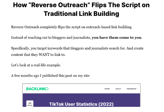
You’re far better off with a design that is simple, readable, and easy to scan like this one:

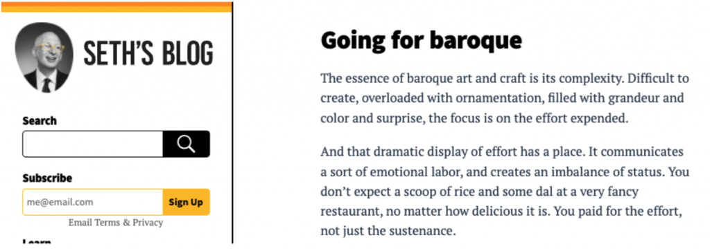
The fact is, some of the most visited sites on the internet are pretty straightforward. Like this one:

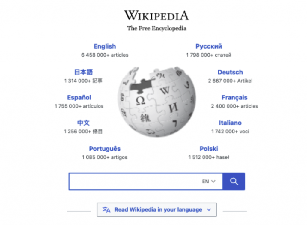
Or, this one:

Superb web copy and stunning graphics are great to have, but focus on functionality first.
And don’t be afraid to imitate existing design. Instead, you should steal boldly (and legally).
Your compass for all your homepage content creation and design comes in the form of a single overarching question:
Idea #4: Who’s it for?
When you create a homepage, your work is wasted if you don’t have a specific persona in mind. It’s the context for every decision you make.
Here are some more minor Wayfinder questions to navigate by:
- What other sites does your target audience visit?
- What are some of the triggers that would lead them to search for a product or service like yours?
- Who do they follow? Trust? Like?
Answering these questions may seem like an exercise in soothsaying, but your customer is the best guide for finding answers. Make it a goal to master the art of asking questions. It will serve you well.
Of course, SEO, site speed, and security are essential too, but writing excellent copy and incorporating the three-story framework with clean, straightforward design will put you way ahead of most competitors.
The wrap-up
Ask yourself how well your website picks up where your conversation with prospects leaves off. Where are the gaps?
Use clear, lean copy to frame up the major homepage sections:
- Write a headline that gets attention
- Use the lede to connect by empathizing with FUD
- Offer promises and proof in the body of the page and anticipate objections
- Your conclusion seals the engagement with social proof and a clear CTA
Incorporate the three-story framework to pave the way forward for a better story.
Continuously review your work and ask yourself if it’s addressing your ideal customer.
Need some help with website homepage ideas? Share your homepage url, and we’ll offer a friendly suggestion or two.

